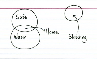
Go back up the hill, kid.

[src] - via Indexed
I really love the simple yet profound style of Indexed - mind beding simple "comics" (art pieces? visual haikus?) fitting in on a single index card, lines and all. They are all visualizations in the fullest meaning, either a line chart or overlapping circles.
Often, like in the sledding example embedded above, there is an implied X-Y scale to the circles as well - maybe comfort vs excitement And with sledding just crossing the red line, into the "clear" field above you can read in a bit more even without reading the full tag line.
Or am I reading too much into two arrows, three circles, four words?